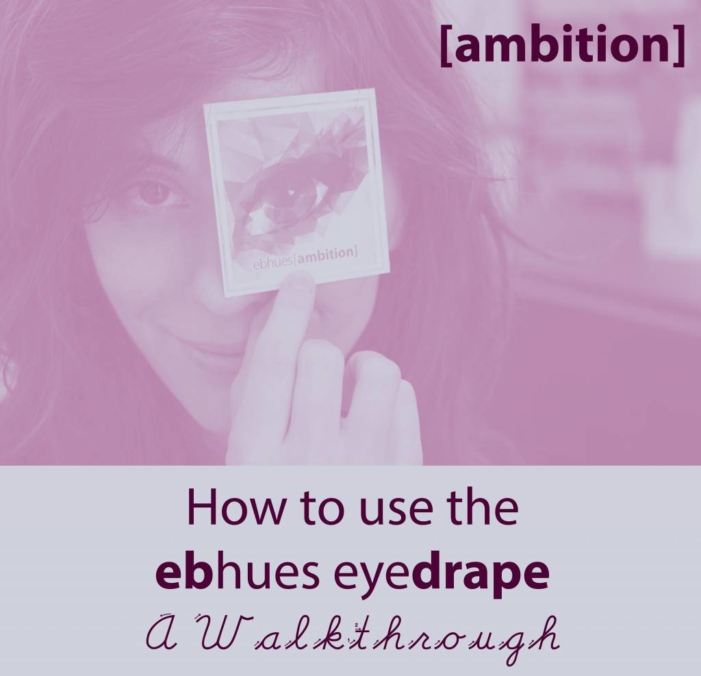
How to find your best pink!
- Posted on
- By Blake
- 0
Greetings beautiful color lovers! It has been several weeks since we last posted about the eyedrape and we have had a lot of orders and a few questions. We wanted to provide another resource for those of you who are going through the process of finding your best tones in each hue. One of the inquiries we often get is “What if more than one color looks really good on me and they aren’t in the same hue zone?”
The answer is a bit tricky, so we decided to show you the drape with pictures using the other namesake of the company, Elea. Elea, having returned from Knoxville after her graduation, wanted to try out the Ambition colors as she didn’t have any soft purple-pinks to wear.
The results were surprising but not abnormal for a drape session!
The Light Colors

We started with the lighter eyeshadow colors of the drape, given that she was looking for a good natural eyeshadow to wear for turning in resumes. After draping the light Ambition colors we asked several questions:
- What color is she most attracted to?
- What color stays the most true to its tone?
- What color emphasizes her skin best?
In this case, a rare thing happened, the answer was the same for each question- Discrete. The answer may not always be the same for each question. Discrete was as soft and matte as she was looking for in an eyeshadow, and stayed the truest to its original color once applied. As for the last question, spacing matters here when you are draping your arm. Ensure you give each color enough skin space to see how it reacts with your tones. When you look at Nerdy you can see how the edge seems to stand out from the skin, almost like it is sitting on top of the skin versus melding with it. These colors are ones you want to avoid as they are fighting your skin not emphasizing it.
Professional also fights with the skin in a less defined way. Unwavering and Discrete both meld with the skin tone and because of this Unwavering is not ruled out. Unwavering did alter a hair compared to his original color of application, which is why he is marked as a secondary option and Discrete is marked as a first. This means that his hue zone, while not the best, is not off limits either. When looking at their codes this makes sense as Discrete is an A31 and Unwavering is an A11 which is located close to one another on our hue color spectrum.
Maybe you don’t see any difference between the colors, stay calm we have a tip for you in the medium drape colors…
The Medium Colors

The next part of the Ambition hue drape was the medium tones. Here we had a bit more difficulty as the answers to the three questions differed in terms of what was liked versus what looked best. If you are at home doing the drape yourself and feel pulled to different colors, or if you are arguing with a buddy who is doing it with you… or even if you veer the way of Jon Snow in that you know nothing- we have a tried and trusted method for you to settle the dispute.
Enter the paper quality check.
Take a WHITE sheet of paper and with either a q-tip or brush swatch the color on the paper. You can use water but don’t dilute the color too much or your results will be off. Put the paper next to your arm swatches and evaluate.
Before the paper entered the picture we quickly evaluated that Non-Confrontational was absolutely wrong for Elea’s skin tone. The color stood out and appeared garish and angry on her skin. Subdued was not bad but it did appear redder on her skin and made the surrounding area a bit splotchy. While she was personally drawn to this color more than the others, after seeing the difference she admitted it was not the best for her. The same was true for Introverted, however, she was not drawn to that color in the least bit so there was no argument needed there. Again it was not bad on her, it just wasn’t as true as Chatty. We found that the same results held from the light drape colors in regards to A31 being number 1 and A11 being number 2.
The Dark Colors

The dark eyeshadow colors were next in the drape, and they posed a difficult problem in terms of another issue that is often found- what you may love color wise might not be the best for you tone wise. In this case, Narrator was Elea’s favorite color out of the batch due to its matte nature. However, the color greatly differed on her skin to its original tone as well as made her skin appear dull and muted. Her second favorite was Stickler which we found to be the truest to its original tone. This might distress those who would come to expect that the previous finding would hold true for this depth as well. However, these sorts of finding are not abnormal. Some people tend to need a little more of a certain undertone as a color’s depth changes. In Elea’s case, she requires more red in her deeper tones as the deep blue undertones become too heavy. Again this does not mean that Splendid is off limits, the color was quite lovely on her skin and only changed a tiny hair compared to its original tone. This finding only means that in the darker tones, her first choice would be an A11 over an A31.
As this was our finding we were not surprised to find that once we had applied the deepest eyeshadow colors in the drape, the A11 beat the A31 again.
The Deep Colors

As you can see from the swatch comparisons, Dead Pan was the truest color in terms of it’s original. You can also note that Timeless is not greatly different from his swatch, but does appear loads deeper than just a heavier arm swatching would account for. Both Traditional and Groovy turned too yellow on her skin compared to their original tones and were ruled out as options. So, again, in terms of the darker colors, Elea would wear A11 as her first choice with her second being A31.
So now that we had our results, it was time to put the colors on. This can be the most tricky part for those who do not wear a lot of color. A good rule of thumb is to use the lightest of your colors as the base, the medium as the inner V to the middle of the eye. For an extra impressive touch take that same color and apply it right below your lower lashes. The dark color can be used as an outer V color, and for those who fear dark colors just mix it with the medium tone to soften the color or blend. Lastly, the deepest color is the perfect liner color and we highly recommend getting some iLine to make any mineral into a gel!

With just the eyedrape colors and mascara we had a complete look, but because Elea rarely gets her makeup done so we added some White Gold in the middle of the eye and a little wing which we underlined to add some drama.

And there you have it, the Ambition eyedrape. However, this walkthrough applies to more than just this particular eyedrape! Let us know if you have any questions, we are always happy to assist you in your color endeavors!
Comments
Be the first to comment...